
Halden, a cycling apparel brand and its store
Halden is our own made-up cycling brand, built from scratch, logo to size guide. The big problem with buying clothes online is fit, so the identity and the store are built to answer it before the rider asks.
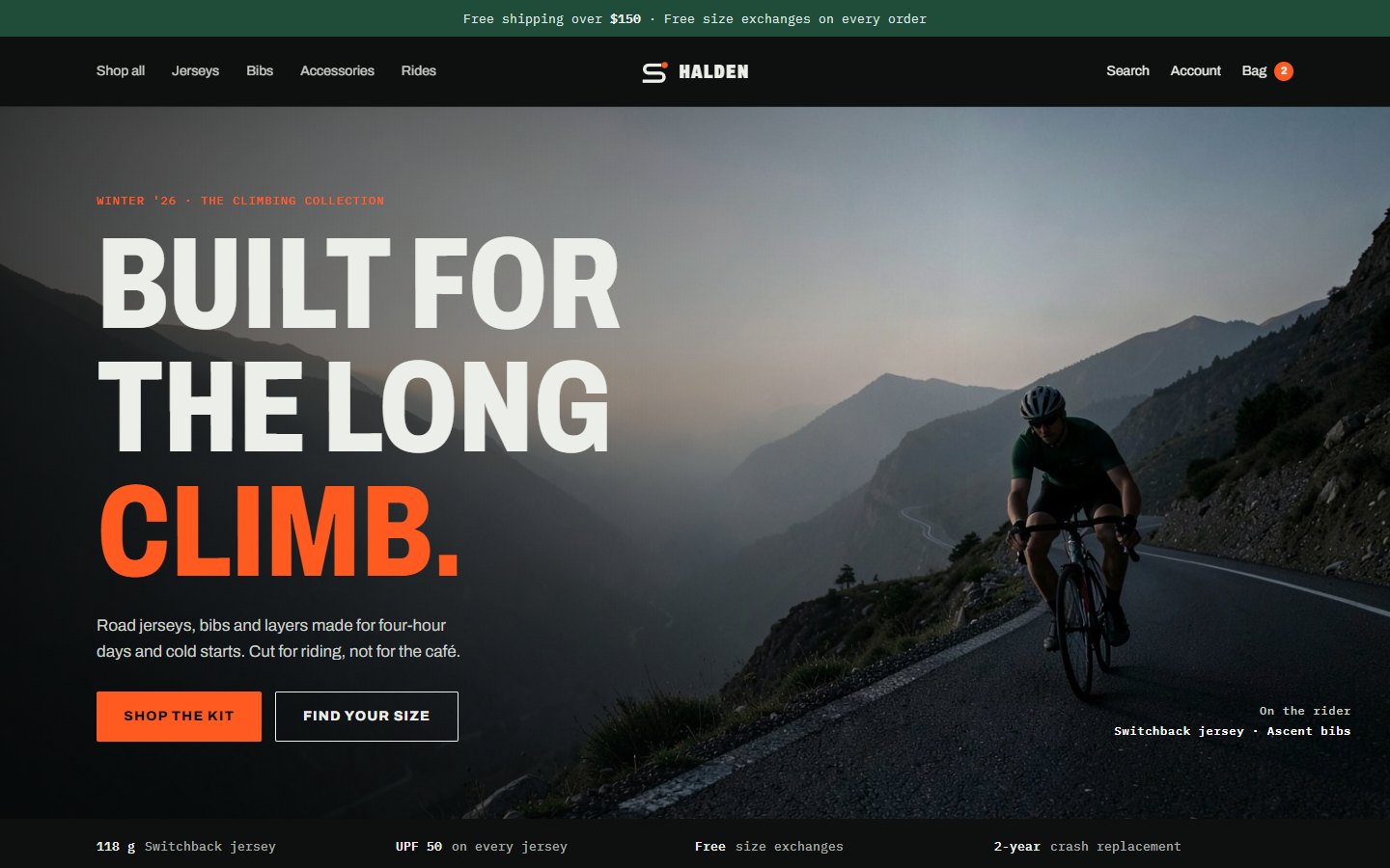
Every screen is a page you can click through, from the homepage to the order confirmation. Open the store
Three decisions that shape it
A climb you can wear
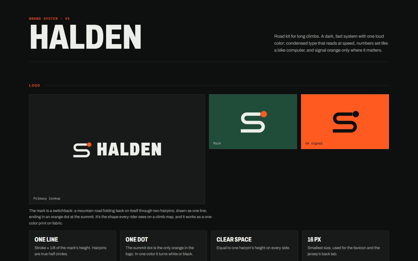
The mark is a switchback, a mountain road folding through two hairpins, with an orange dot at the summit. One line, one color, so it prints cleanly on a sleeve.
Signal orange means go
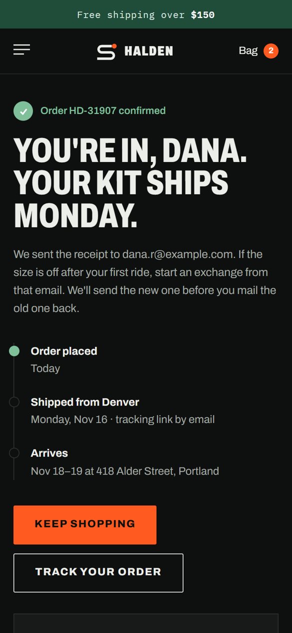
Signal orange, borrowed from road safety gear, shows up only on the next step: add to bag, check out, pay. Green confirms good news, like a size in stock.
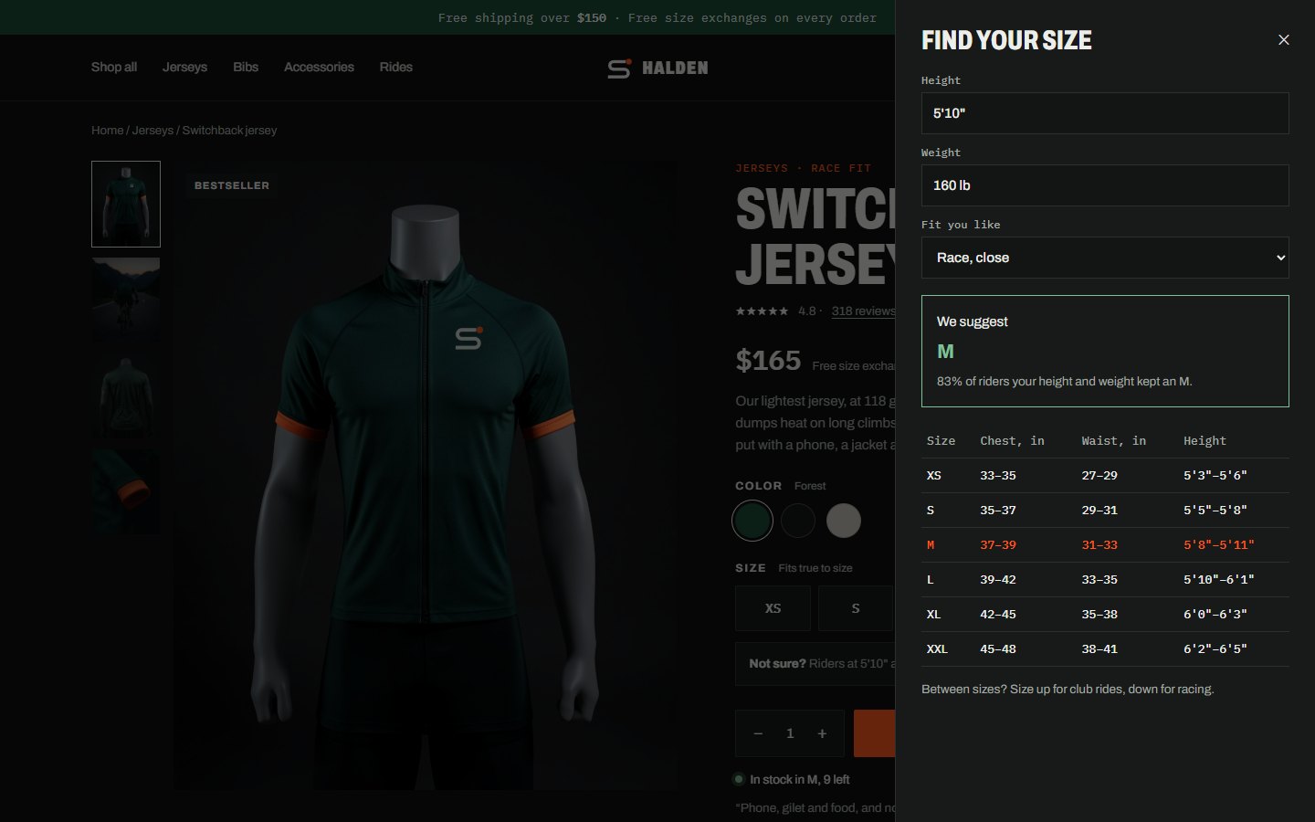
Answer fit before checkout
The size finder, rider heights in reviews, a fit bar and free exchanges each remove a reason to leave the product page.
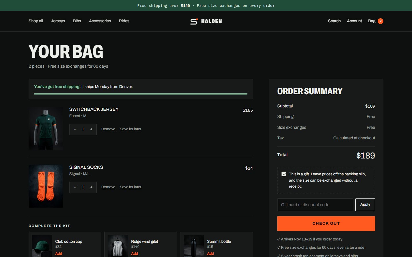
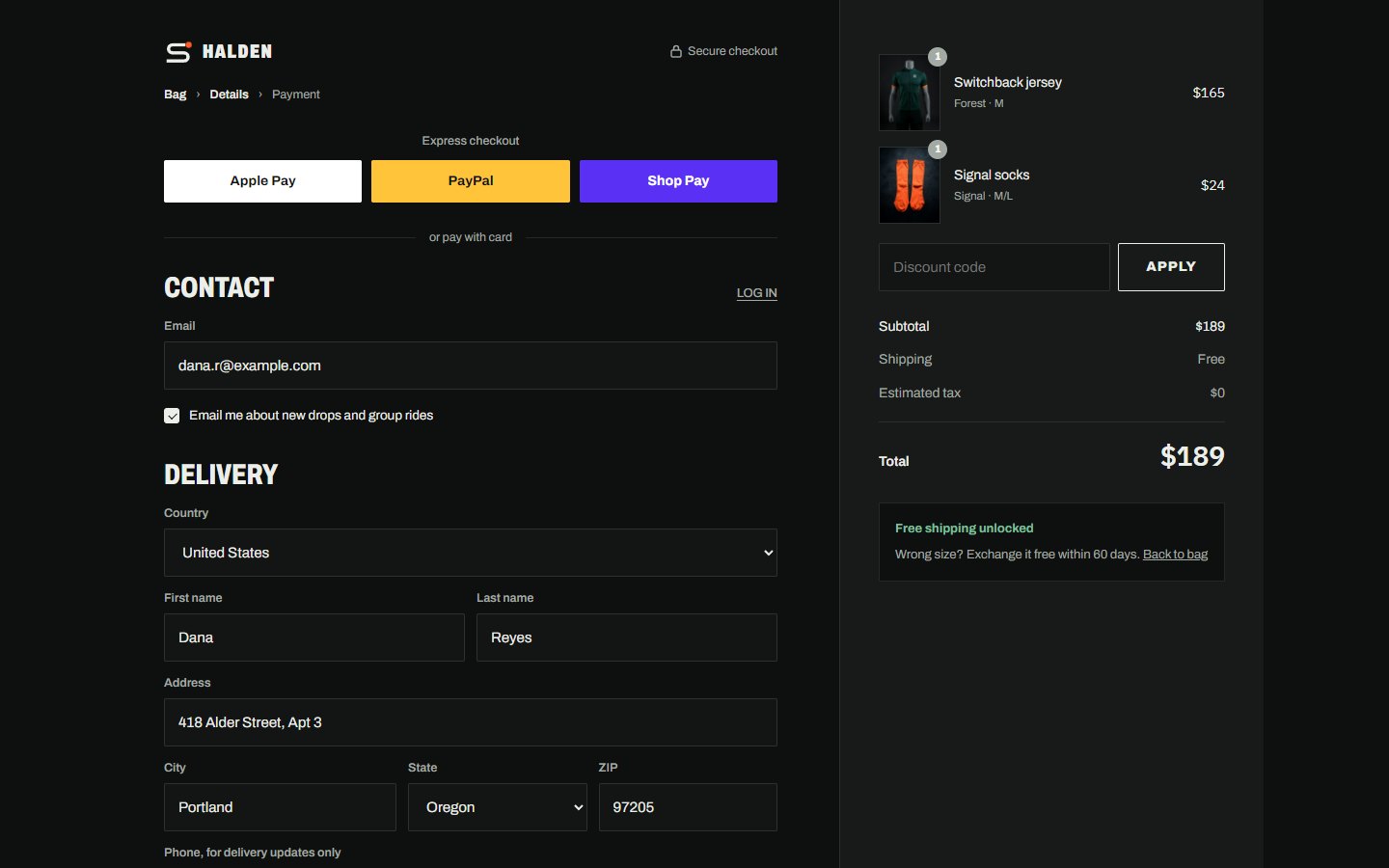
The store on desktop
Tap any screen to see the full page.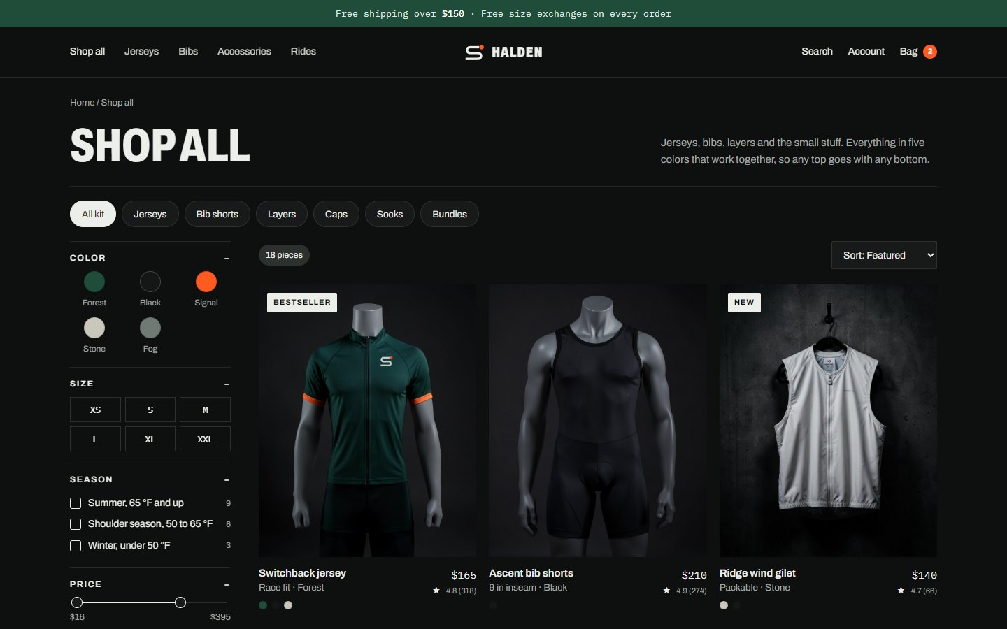
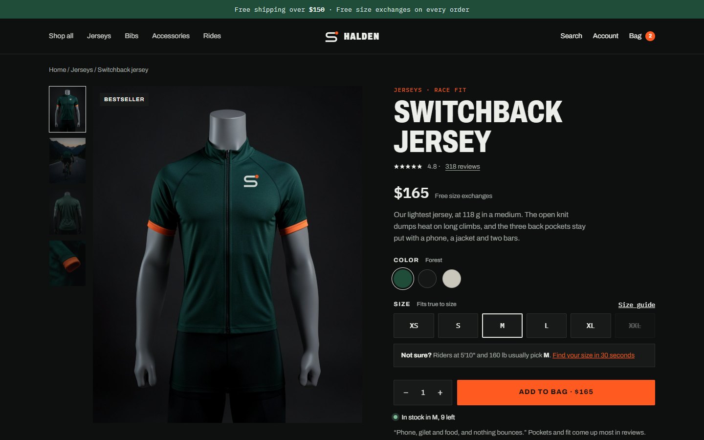
On a phone
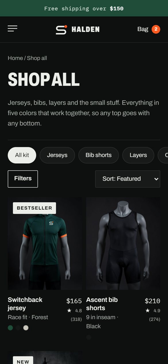
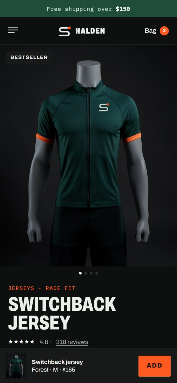
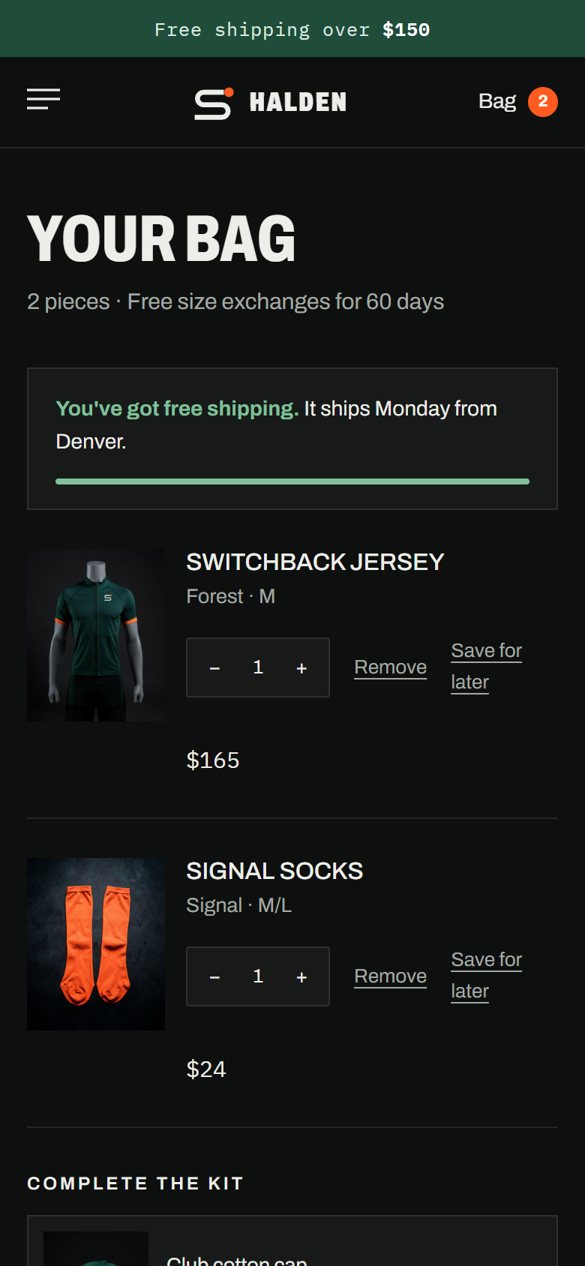
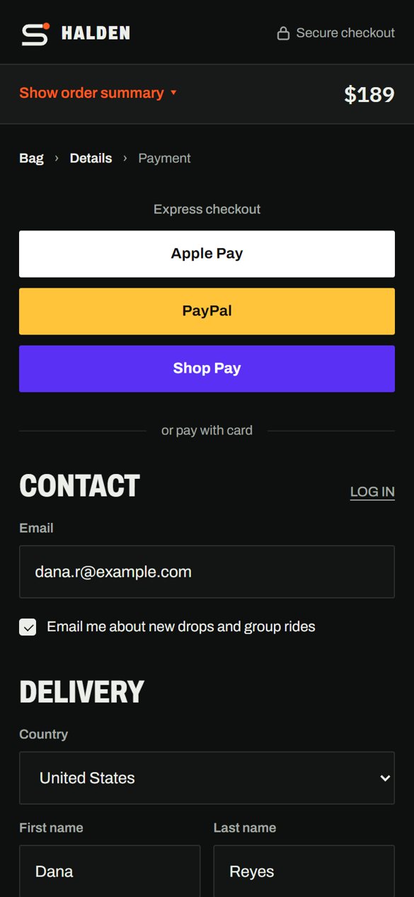
Designed at 390 px, not squeezed from desktop.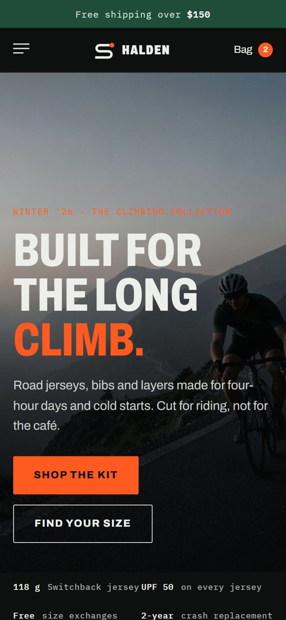
Small details that help riders buy
Halden is a made-up brand we created for our portfolio. Name, identity, store design and image direction by Leo Reed Studio.